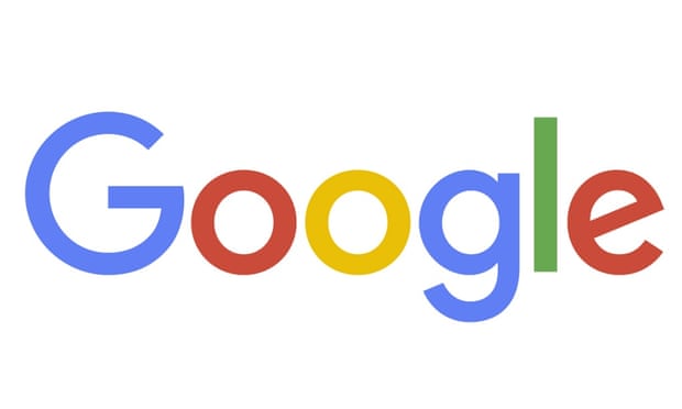
Google Changes Search Engine Logo "What is the NEED"!!!!(Photo)
3 minute read
Just a month after unveiling a major restructuring of the company, Google is updating its image, too.
The new Google logo is still a wordmark, but it’s now using a
sans-serif typeface, making it look a lot more modern and playful. The
colors are also softer than they used to be. The logo bears a bit more
resemblance to the logo of Google’s new parent company, Alphabet, as
well. Alphabet’s wordmark has a similarly unadorned look, and this
update makes the two companies’ design language fall more inline.
As Google’s video introducing the new logo notes, the wordmark has
been evolving ever since it was created in 1998. But this is easily its
biggest change since 1999, when Google first cleaned up the lettering
and settled on its four colors. Since then, the logo has just been
flattened out more and more, with today’s update representing a huge
leap. In addition to changing up the wordmark, Google is also changing
the tiny “g” logo that you see on browser tabs. It’s now going to be an
uppercase “G” that’s striped in all four of Google’s colors. Google says
that the new design will be rolling out across all of its products soon
— in fact, it’s already on Google’s homepage, with a cute animation
that wipes away the old logo and draws in the new one.
THE NEW LOGO IS MEANT TO REFLECT THE NEW WAYS PEOPLE VISIT GOOGLE
So why did Google decided to make the change?
According to Google
Google said the new design would soon be seen across all its
products. Google’s homepage introduced the redesign with an animation
that wiped away the old logo and drew the new one.
“Google has changed a lot over the past 17 years – from the range of
our products to the evolution of their look and feel. And today we’re
changing things up once again,” the company said in a blogpost.
The company said the redesign was meant to reflect the way that
people interact with Google products across many different platforms,
apps and devices.
“It doesn’t simply tell you that you’re using Google, but also shows
you how Google is working for you. For example, new elements like a
colorful Google mic help you identify and interact with Google whether
you’re talking, tapping or typing. Meanwhile, we’re bidding adieu to the
little blue ‘g’ icon and replacing it with a four-color ‘G’ that
matches the logo.”
The logo has undergone many, mainly small, changes in its history.
The colours have changed, 3D letters have been flattened, and an
exclamation point came and went in 1999.
The move comes just a month after a major restructuring of the company was unveiled. Google is now owned by Alphabet,
a holding company created by founders Sergey Brin and Larry Page to
separate their money-making search engine company from the loss-making,
“moon shot” projects like robot cars, medical research and
internet-delivering balloons.
In a blog post, Google
discusses how much technology has changed how we interact with its
products and with the internet at large. It doesn’t really settle on a
specific reason that a redesign was needed, but it says that this logo
should better reflect the reality that Google is no longer a site you
visit on a desktop computer — it’s a huge collection of sites, apps, and
services that you visit on PCs, Chromebooks, smartphones, and anywhere
you can find a web browser. Google writes that its new logo is meant to
reflect “this reality and [show] you when the Google magic is working
for you, even on the tiniest screens.


Post a Comment